 What happens when good data makes for bad charts and graphics? You really want to impress your boss and your peers, you have collected data upon data upon data - you have everything in-line for your presentation - but for the "love of Pete" - you can't make the data stand out.
 Well - I found this little graphic and the web site it came from. And let me just say WOW!! There is more information than you can soak in about taking Excel data and making charts / graphs / dashboards to get your point across.
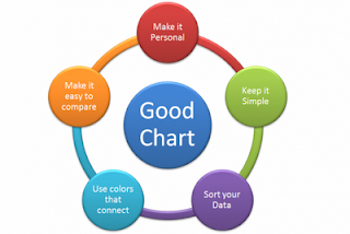
So what makes a Good Chart?? According to Chandoo.org - you need 5 things...
- Keep it Simple - the best way to represent your data is in the most "readable" and "understandable" way possible. Don't complicate things - use what works - and you can do some amazing things within Excel to create your charts. But simple is aways better.
- Sort Your Data - once again, make your data pop but sorting it the way that makes sense - if you want to present an idea of growth - make sure you data supports that picture and go from small to big - left to right.
- Use Colors that Connect - most of us are not "color coordinated" and the cool combo today may be quickly out of style tomorrow. So use a site like http://www.colorcombos.com/ to get your colors right - or if your company has a authorized color chart - use it and stay within their "branding" guidelines.
- Make It Easy to Compare - if you are using data that needs to be compared with other data - your charts should be up to that task. Don't use bar charts in one and then a pie chart in another - that's too confusing for your audience. Once again, keep it simple to follow, which means make it look and feel the same for comparisons.
- Make It Personal - your audience wants to know something - they are seeking knowledge of some type or another. So allow them to ability to quickly get to "your point" - if you have to drag them along, then either your message is wrong or your audience is wrong. If you can't make it personal to them - then don't bother making the presentation.
So that's it. And check out the cool stuff at http://www.chandoo.org/ he is giving away at least a Masters Degree in Excel Charting. Enjoy!


Hello Arnie,
ReplyDeletethank you so much for linking :) And thanks of the colorcombs link, didnt know about it.